Nomad Properties Panel
Notes and Domino Designer used small boxes to manipulate the items within the app. The infoboxes were developer built, with extra controls being tacked on adhoc. The goal of this project was to to systematically convert all 200+ infoboxes into a modern properties panel, then improve the usability of frequently used or particularly convoluted individual controls and sections.
Starting point
Painpoints
Controls were inconsistent, often following different patterns as other boxes that manipulated the same property.
Infoboxes floated on top of Domino Designer in a separate window, making them easy to loose track of.
Infoboxes were very small and could not be resized, causing issues for the primarily older user demographic.
Controls were extremely outdated and hard to understand. Many had no apparent effect on the canvas.
Technical Constraints
There were over 200 individual boxes, and over 40 contexts in which they could be shown. It was not feasible to touch each individually.
Moving controls out of their tab was a heavy development lift and often caused bugs elsewhere.
The lack of consistency in controls made forming a systematic translation to modern react components a challenge.
Backwards compatibility with the old client meant I couldn't change the underlying effect a control had.
Basic pattern translation
Layout
Responsive Behavior
Section Specific Designs: Table Properties
Color Picker, Custom Styles & Themes
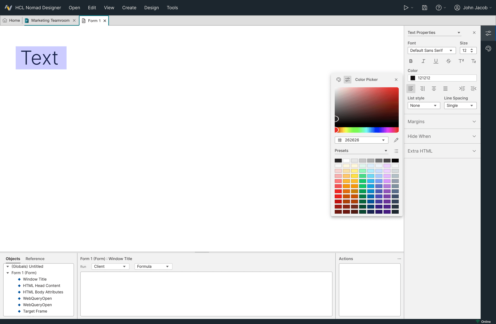
Once the properties panel was implemented, I created an improved color picker, allowing the creation of custom color styles and surfacing default and customer created color themes.


