Nomad Mobile
Project Scope:
Optimize the navigation pattern for mobile devices, improving the way users navigate between and interact with applications.
Context:
Nomad is a web translation of a product that has been around since 1985. It’s a part of Domino, which consists of a low code application designer and a client to run those applications, plus airtight security. Up until late 2019, the only available client was Notes, a downloaded software with OS limitations that released an annual update. Nomad translates Notes capabilities into a web browser and native mobile app.
There are a huge variety of business sectors that use Notes Domino: government, food science, cruise ships, oil rigs, manufacturing plants, farmers, environmental monitoring agencies etc. Companies use custom applications that are business critical and may date back to the 1990s.
User Demographics
The average end user of Notes or Nomad is interacting with company specific applications to carry out daily business functions.
All data on Domino Servers is stored on prem, so we have no way to gather specific user interaction data. Most companies sign a license agreement with HCL to use Domino products, but have a 3rd party - what HCL refers to as a business partner - administer the usage of the client. These admin are experts on all things Domino, but do not use applications in quite the same day to day capacity as the end user. I relied on the input of business partner admin and internal users.
Age:
Working age, 22-65
Mobile expertise:
Second nature to daily struggle
Business Use:
Any
Example Use Case : The chicken farm
There are a huge variety of business sectors that use Notes Domino: government, food science, cruise ships, oil rigs, manufacturing plants, farmers, environmental monitoring agencies etc. Imagine a company like Tyson. There are an ungodly amount of chickens being raised from egg to dinner table. Like any product, they are inventory and need to be tracked and managed throughout their lifecycle. There is a central office where employees monitor this data, and a number of chicken living facilities dispersed throughout multiple rural areas. To gather data on these chickens, someone needs to go visit these remote chicken coops. A mobile device is the natural choice for quickly recording information whilst standing among thousands of chickens.
Opportunities for Intervention
Since I was not able to speak to end users during the initial research phase for this project, I came to the following conclusions through conducting a heuristic analysis of the current app navigation.
Navigation structure was not optimized for mobile devices, resulting in a disjointed and frustrating experience.
Users struggled to seamlessly access and manage crucial database records on the go.
The absence of mobile-specific design patterns and features made it difficult for users to navigate applications and perform tasks they were accustomed to on the desktop version.
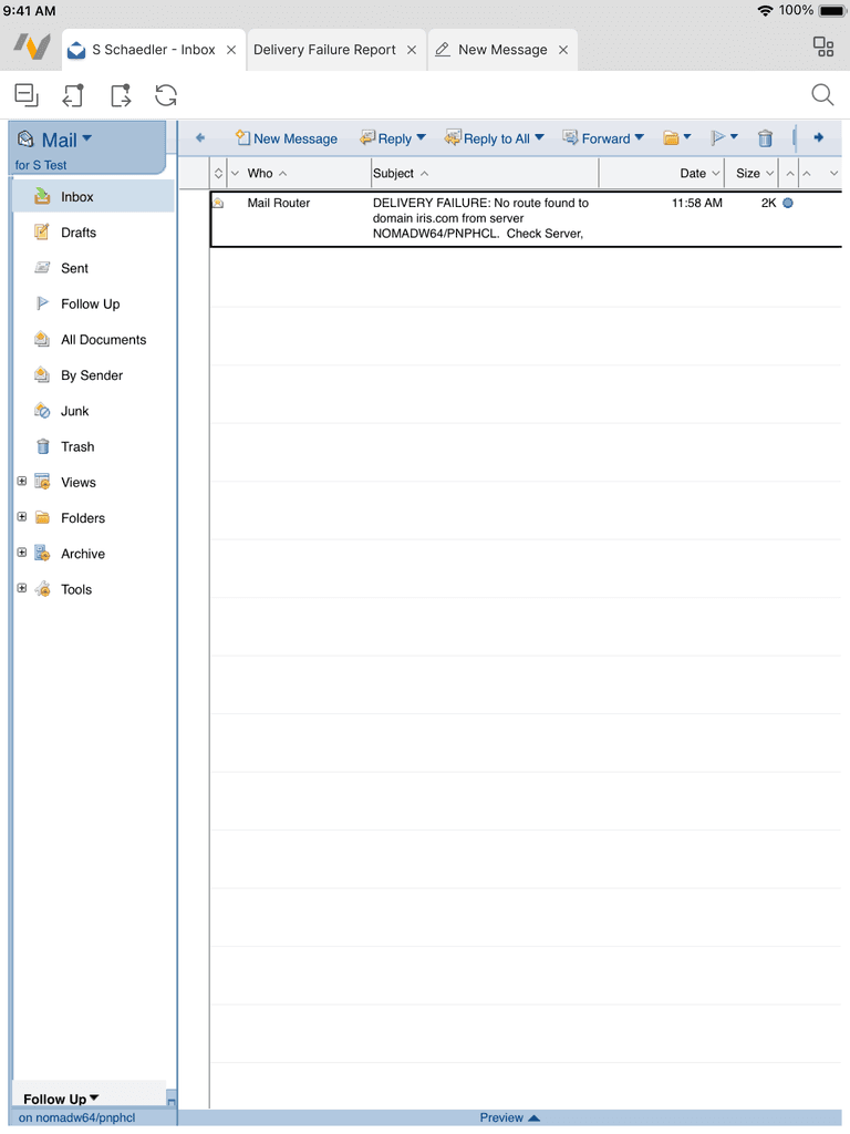
Home page only shows recently accessed apps. Users may have access to 10-100 applications.
"Workspace," which allows users to organize apps by grouping, is not available on mobile.
No available actions or customizations features for app tiles.
No way to search all applications available.
Redundant open buttons not mobile optimized.
Traditional tab orientation quickly becomes unusable due to limited space.
Tabs from different applications are mixed together, making it difficult to find what you’re looking for.
Lots of toolbar icons without clear meaning.
Disjointed search experience within the application database.
Favorite user features from desktop, such as Quick Search, were not available on mobile.
Hamburger menu is used for random menu items, not navigation.
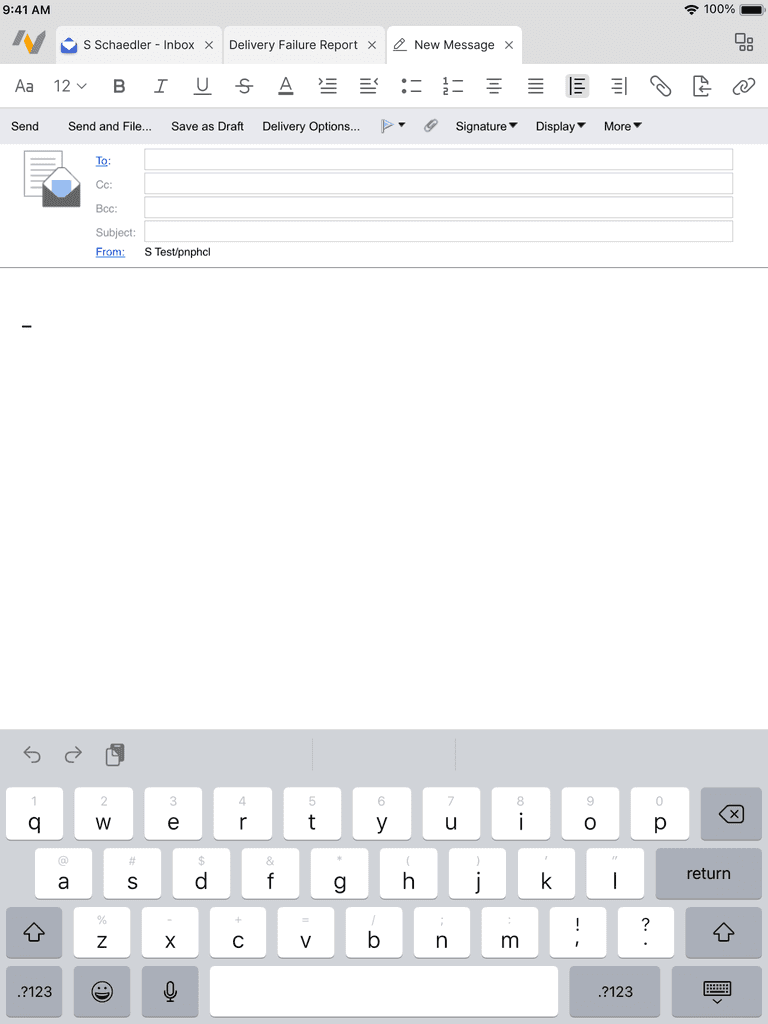
Text edit menu makes it difficult to access most formatting options.
Common actions, such as insert image, are obscured.
Pattern research
After identifying the main areas of intervention, I researched related patterns users would be familiar with. I found the strongest relation between Nomad and web browsers.
Low Fidelity Wireframing & Usability Research
After working through a few different iterations, I tested designs with 4 internal users and 4 external users (business partners).
Outcomes
Workspace
Familiar layout and actions expected from an app catalogue.
Long press to switch server copy or rearrange apps, creating more control.
Swipe between workspace pages or search all apps across pages to simplify navigation.
Navigate between other full page actions, focusing on one task at a time.
Open application & quick find
Long press on a sortable column to open quickfind, bringing a user favorite feature to mobile.
Navigate to the document matching the query and tap to open, reducing scroll time.
Document opens in the tab next to the parent database for easy return navigation.
Switch tabs
Swipe between all open tabs for the focused application.
Open tab overview page to switch applications and see all open tabs in an intuative layout.
Focused application always appears at the top of the tab overview page to preserve context.
Navigate between grounding utility pages- Home, open app, replication, and tab overview.
Navigate framesets
Move between framesets without confusion by seeing them in their desktop orientation.
Switch automatically for applications with only 2 framesets, user makes selection when 3+.
Text edit toolbar
Mobile friendly text edit tool bar with common actions as shortcuts.
Full editing capabilities in an easily digestible layout under overflow menu.
Tablet
previous


